
Blueprints: Alabama's College Initiative
Building a visual identity for mentorship that bridges educational inequality.
Team Specifics
Role: Designer
Client: Alabama Possible / Blueprints College Access Initiative
Founder: Nicole Bohannon (University of Alabama, 2009)
Project Type: Brand Identity, Collateral Design, Editorial Design
Context
Blueprints is a college access program that connects high school students and their families with resources and relationships so they graduate college and career ready. The program utilizes a "near peer" mentoring model, engaging college students as mentors who demystify the college-going process and guide high school students through admissions.
Alabama faces significant educational challenges. As the sixth poorest state in the nation, 27.6 percent of children live below the poverty line, and only 22 percent of adults hold a bachelor's degree compared to national averages. Low-income, minority, and first-generation students especially lack "college knowledge" including how to finance education, complete admissions procedures, and connect career goals with educational requirements.
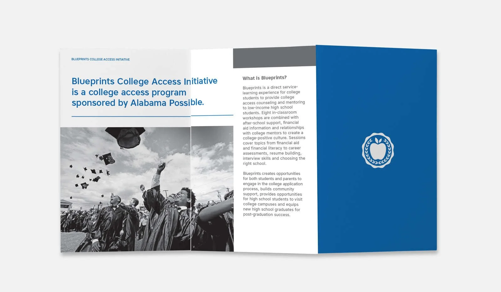
Blueprints addresses this gap through eight in-classroom workshops combined with after-school support, financial aid counseling, and meaningful relationships with college mentors. The program serves freshman through senior high school students, giving them time to plan, prepare, and pursue their college or career goals.
Problem
Blueprints needed a visual identity that would resonate with multiple audiences: high school students seeking guidance, college student mentors looking for meaningful service opportunities, parents navigating an unfamiliar system, and community partners providing support. The brand needed to feel approachable and inspiring rather than institutional or condescending.
Without a cohesive visual system, Blueprints risked appearing fragmented or overly academic, potentially alienating the very students it aimed to serve. The identity needed to communicate hope, accessibility, and tangible support while honoring the program's hands-on, relationship-driven approach.
Challenge
The core challenge was translating the "near peer" mentoring model into visual language. The logo needed to demonstrate knowledge passing from one generation to the next, the literal act of reaching out and touching lives through education, without feeling heavy-handed or cliché.
Additionally, the identity system had to work across diverse applications: from professional stationery for community partnerships to t-shirts and buttons that students would actually want to wear, from college pennants that honored school pride to editorial layouts in magazines targeting donors and stakeholders.
Creating something that balanced professionalism with youth appeal, seriousness of mission with optimism about possibility, all while authentically representing a program in my hometown that I cared deeply about, required both restraint and conviction.
Solution
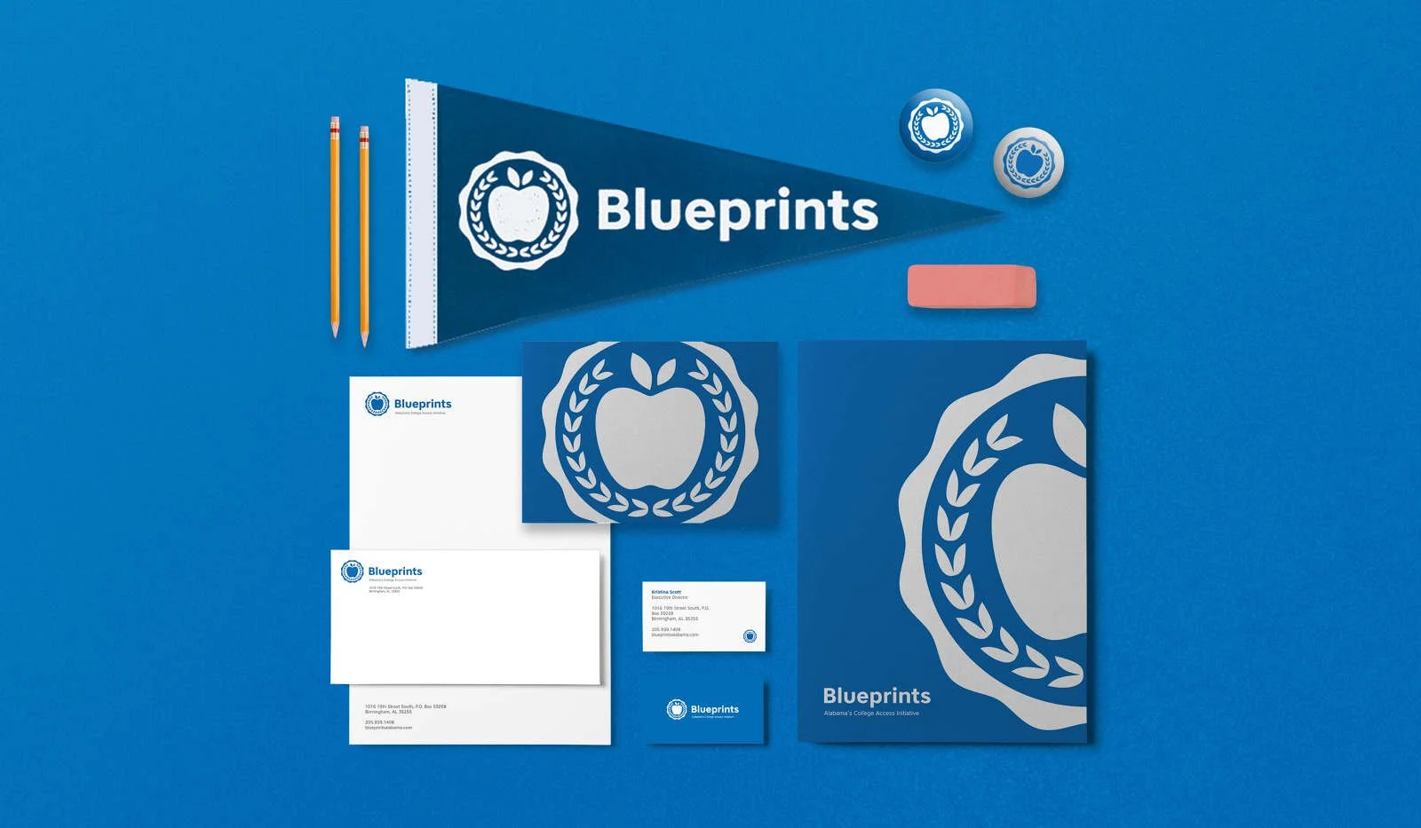
I developed a logo that literally visualizes mentorship as a hand reaching down to lift another hand up, embodying the "near peer" model and the tactile nature of "touching lives through education." The mark is simple and immediate, communicating the program's core promise at a glance while avoiding academic or corporate visual tropes.
The visual identity extended across a comprehensive system:
Core Identity:
Logo design emphasizing generational knowledge transfer
Stationery system for professional communications
Student-Facing Materials:
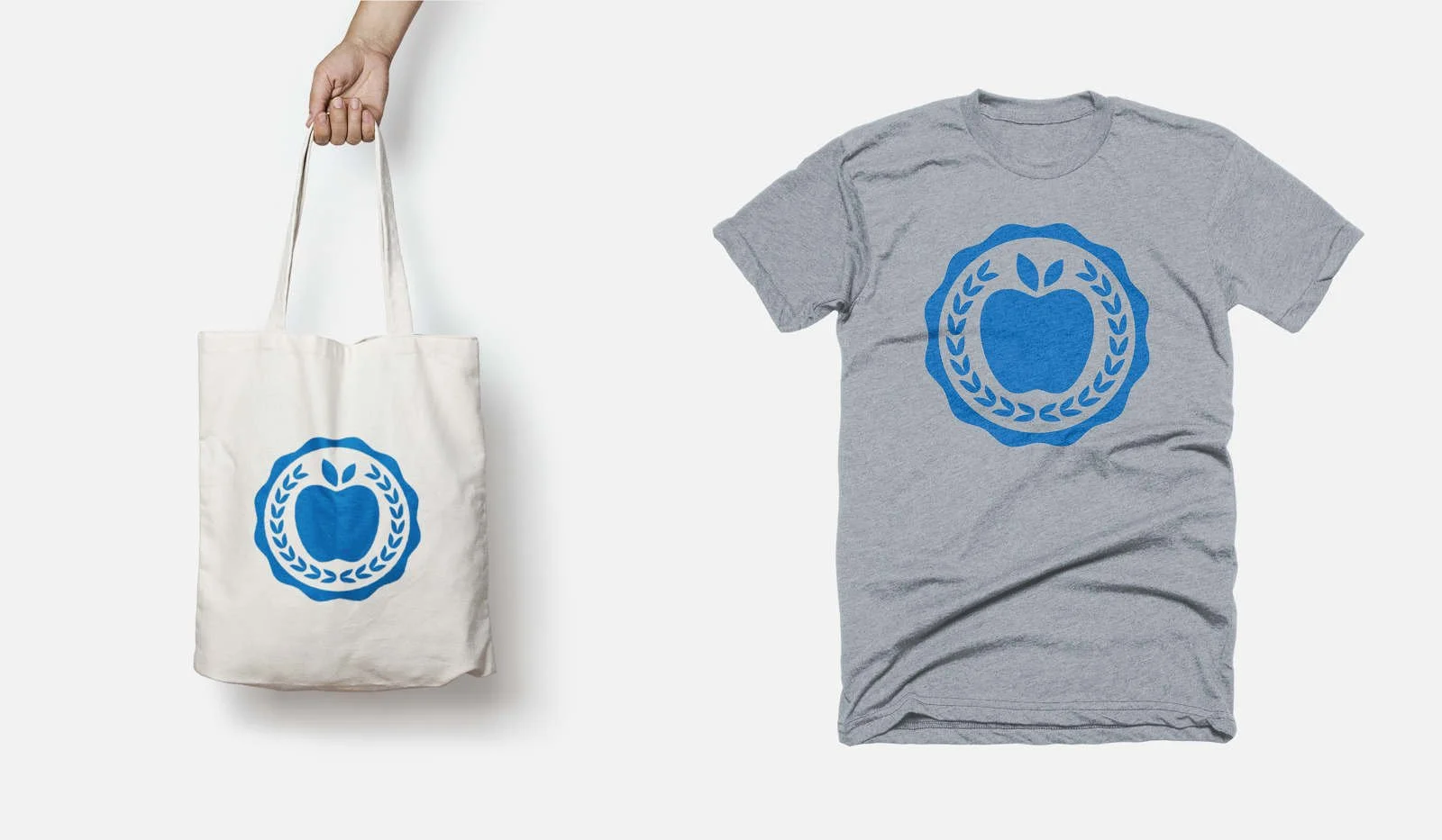
T-shirt designs that students would wear with pride
Buttons for visibility and community building
College pennants honoring students' school affiliations
Communications:
Editorial layouts for magazine features targeting donors and partners
Collateral materials supporting program visibility and fundraising
Every touchpoint reinforced the same message: education is achievable, support is available, and the path forward is built through relationships. The design balanced accessibility with aspiration, meeting students where they are while pointing toward where they could go.
This work was personal. Giving back to my hometown mattered, and the design needed to honor both the seriousness of educational inequality and the real hope that mentorship provides.
Results
Created a cohesive visual identity that effectively communicated Blueprints' "near peer" mentoring model
Developed a flexible design system that worked across professional, student-facing, and community contexts
Produced tangible materials (t-shirts, buttons, pennants) that built program visibility and pride among participants
Supported Blueprints' mission to address educational inequality in Alabama through clear, compelling visual communication
Contributed design expertise to an organization working to close the educational attainment gap affecting 60 percent of Alabama's income disparity
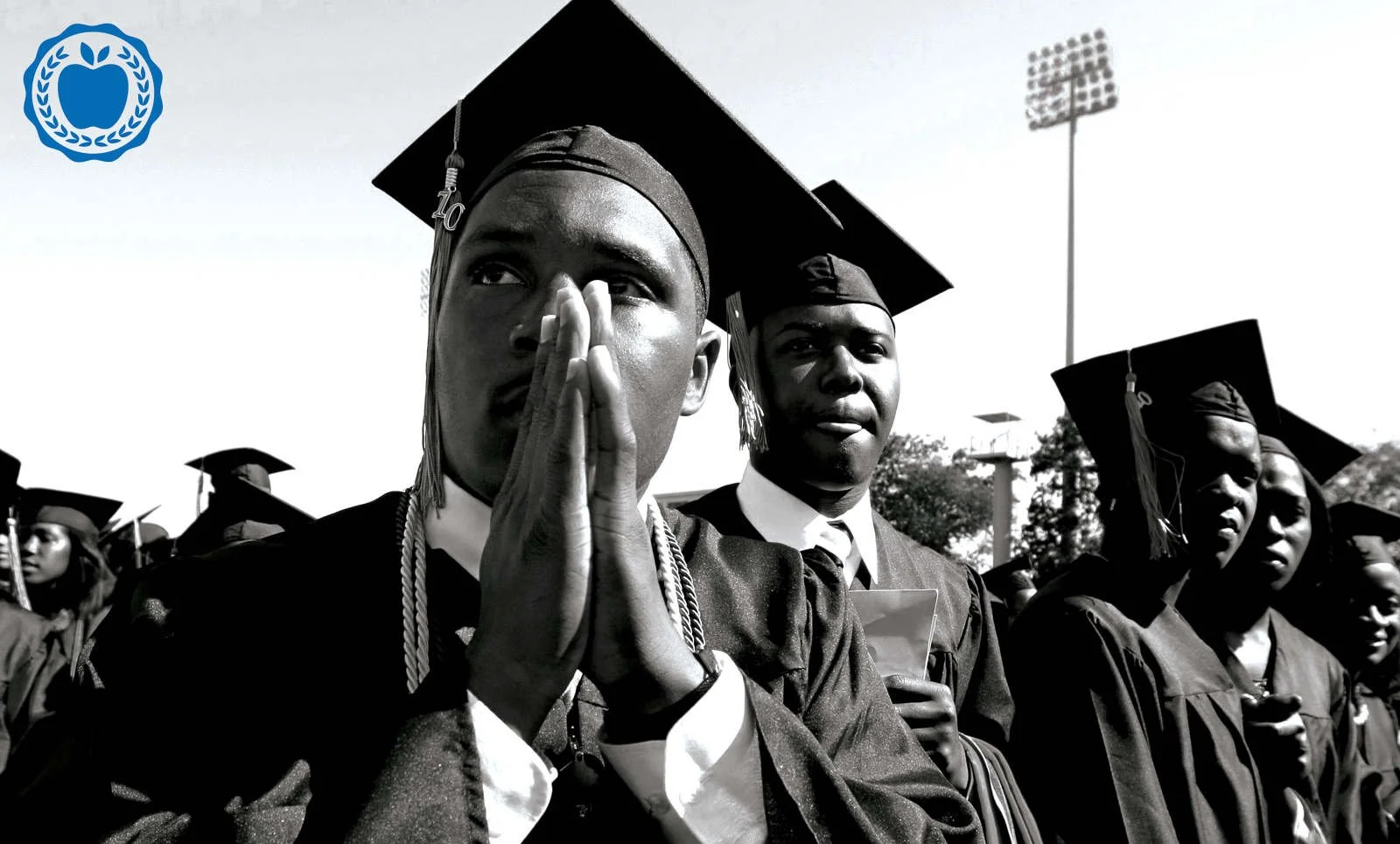
85% college acceptance rate for participating students
$6.2 million in scholarships secured by Blueprints participants
Program growth and continued operation demonstrating sustained impact
Visual identity supporting an initiative that measurably changes educational trajectories
What I Learned
This project reminded me that design can serve communities, not just clients. Working on Blueprints wasn't about portfolio building, it was about contributing something meaningful to the place I came from.
I learned that the best identity work happens when you deeply understand not just the organization, but the people it serves. The "hands reaching" concept worked because I understood what mentorship actually feels like, the vulnerability of asking for help and the generosity of offering it. That emotional truth made the visual metaphor resonate.
The project also taught me about designing for dignity. These students weren't charity cases, they were capable young people navigating a system that wasn't built for them. The identity needed to reflect their potential, not their circumstances. Every design decision, from color choices to typography to the confidence of the mark itself, had to communicate belief in their abilities.
Finally, working across such diverse applications, from corporate stationery to student swag, reinforced that strong identity systems are both consistent and flexible. The core idea (mentorship, connection, uplift) remained constant while the execution adapted to context. A good logo works on a business card and a t-shirt for different reasons, but always with the same integrity.