The Everywhere Project: Chattanooga
Creating a vintage luggage label through persistence and place-based research.
Team Specifics
Role: Contributing Designer/Illustrator
Curator: Adrian Walsh (Designer/Illustrator, Southern Idaho)
Project Type: Collaborative Design Series
My Location: Chattanooga, Tennessee
Context
The Everywhere Project is a collaborative design initiative that pays tribute to the classic folk song "I've Been Everywhere," written in 1959 by Australian songwriter Geoff Mack. The song was adapted to North American locations by Hank Snow in 1962, hitting number one on the country music charts, and has since been recorded by artists including Johnny Cash and Willie Nelson.
The project invites a select group of designers and illustrators to create luggage labels, each representing one of the 92 locations from the American version of the song. Each artist shares their personal take on a place they've been, have connections with, or recently learned about. The entire series celebrates American geography, typography, and the nostalgic aesthetic of vintage travel.
Problem
The Everywhere Project operated on an invitation-only basis, with the curator selecting designers for each of the 92 locations. As someone passionate about Southern design and place-based work, I saw this as an opportunity to contribute, but I wasn't on the initial invitation list.
Additionally, the project required balancing historical authenticity (vintage luggage label aesthetic) with personal interpretation, all while accurately representing a specific location's character and landmarks. Each label needed to stand alone as a strong design piece while contributing to a cohesive 92-piece collection.
Challenge
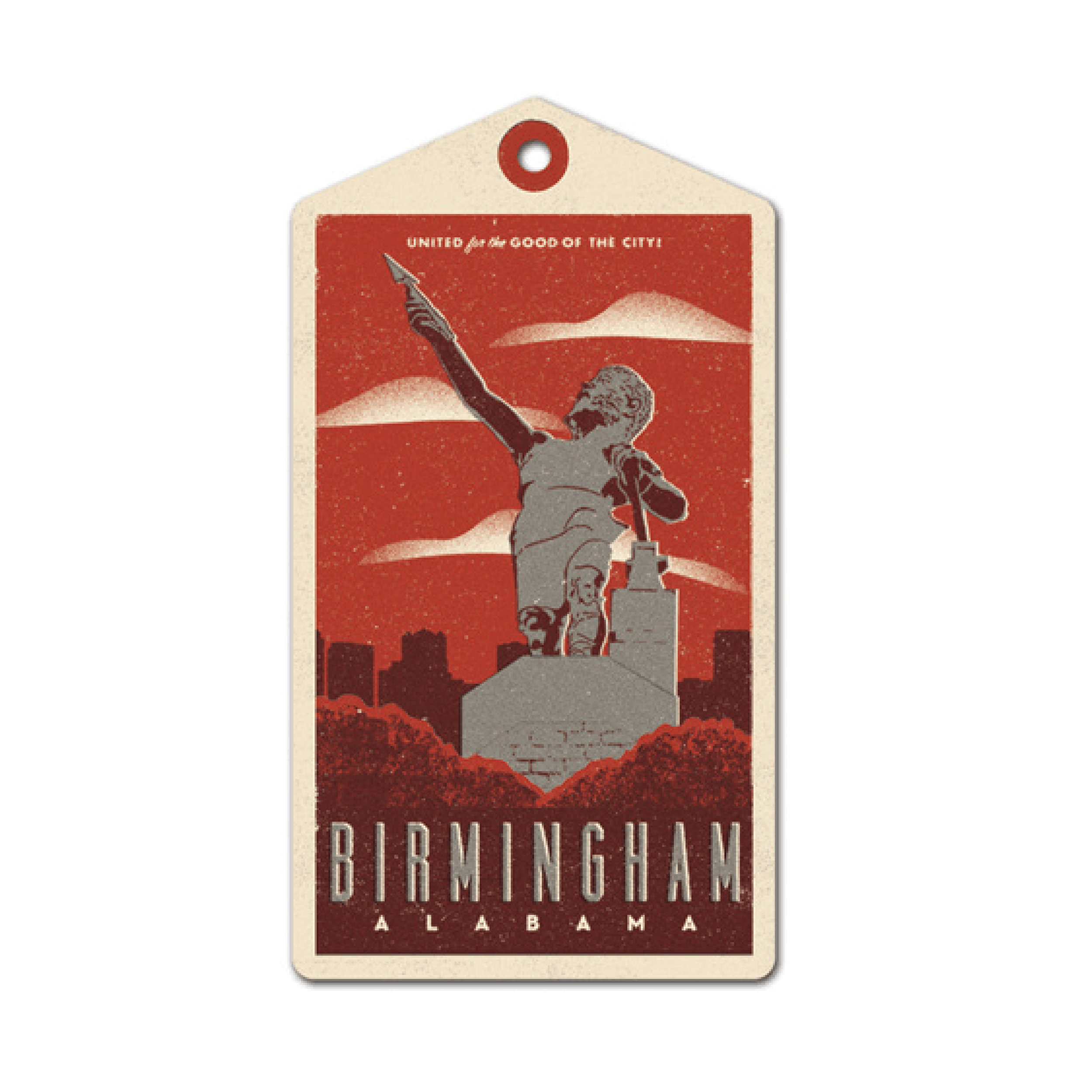
The first challenge was getting into the project at all. I wanted to represent my home state of Alabama, specifically Birmingham, but that city wasn't included in the song's lyrics. I had to decide whether to advocate for my inclusion and risk rejection, or simply move on.
Once I secured Chattanooga, Tennessee, the design challenge became about authenticity and research. I needed to:
Capture Chattanooga's identity in a single luggage label
Honor the vintage travel aesthetic without relying on generic nostalgia
Research and select the right landmarks, typography, and visual language
Balance historical reference with contemporary design craft
Create something that felt genuinely connected to place, not superficial tourism
The label had to work within the constraints of the luggage tag format while standing out among 91 other talented designers' interpretations.
Solution
I took initiative and emailed Adrian Walsh directly with a Birmingham, Alabama luggage tag design, making the case for my inclusion. He graciously responded that while Birmingham wasn't in the song, I could take Chattanooga if I wanted it. I immediately said yes.
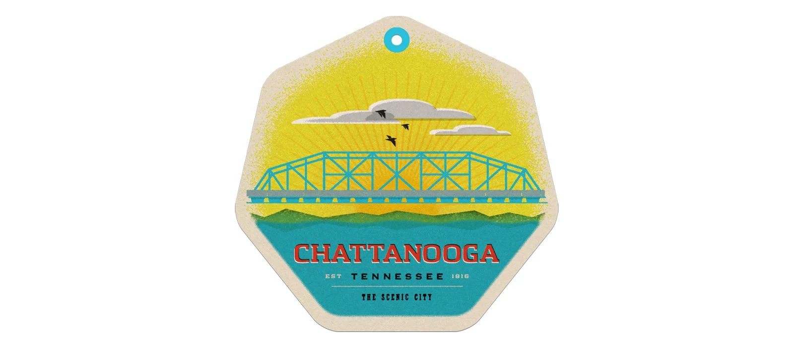
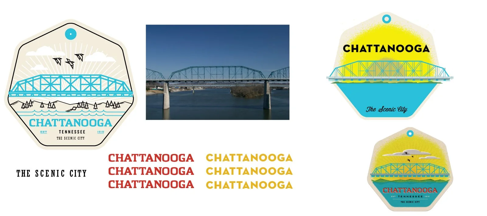
My research process focused on three areas: famous landmarks, authentic taglines, and local typography. I discovered Chatype, the official typeface of Chattanooga, which became the foundation of the design. I paired it with Slackers and Brothers for that genuine Southern charm and regional personality.
For the iconic landmark, I chose the Walnut Street Bridge, one of Chattanooga's most recognizable structures. I incorporated mountains in the background to reflect the city's proximity to Lookout Mountain and reinforce its nickname, "The Scenic City."
Design execution:
Created clean vector artwork in Illustrator
Applied distressed texturing in Photoshop to achieve authentic aging and wear
Balanced period-appropriate aesthetics with legible, contemporary composition
Integrated typography that was both historically grounded and specific to Chattanooga
Designed for the physical constraints of a luggage tag while maximizing visual impact
The final piece honored both the vintage travel label tradition and Chattanooga's unique identity.
Results
Included in The Everywhere Project collaborative design series alongside
91 other designers
Successfully represented Chattanooga, Tennessee in a national design initiative
Contributed to a cohesive collection celebrating American geography and typography
Created work that balanced personal interpretation with place-based authenticity
Demonstrated the value of advocating for opportunities rather than waiting for invitations
What I Learned
The most important lesson from this project had nothing to do with design technique. It was about agency and initiative. I wasn't chosen for this project, I asked to be part of it. That simple act of reaching out, showing my work, and expressing genuine interest opened a door that would have otherwise stayed closed.
Adrian Walsh could have said no. Birmingham wasn't in the song, and he already had his roster of designers. But I made it easy for him to say yes by showing up prepared with work in hand. That taught me that opportunities aren't always offered, sometimes you have to create them by demonstrating value and enthusiasm.
On the design side, this project deepened my appreciation for research-driven work. Finding Chatype, Chattanooga's official typeface, wasn't just a clever detail, it was the foundation that made everything else authentic. Surface-level "vintage" aesthetics are easy. Genuine place-based design requires digging deeper into history, culture, and local identity.
I also learned that constraints breed creativity. The luggage tag format is small and specific, but those limitations forced me to distill Chattanooga's identity down to its essential visual elements: the bridge, the mountains, the typography, the nickname. Sometimes the tightest parameters produce the clearest solutions.
Finally, being part of a 92-piece collaborative project taught me humility and context. My work had to be strong enough to stand alone but generous enough to support the whole. Design doesn't always happen in isolation, and sometimes the best projects are the ones where you're one voice in a much larger conversation.