Regions Bank Advertising Campaign
High-volume production design for a major financial institution across multiple channels.
Team Specifics
Role: Designer
Agency: Luckie & Co.
Client: Regions Bank
Project Type: Multi-Channel Advertising, Brand Collateral
Geographic Reach: 16 states across the South, Midwest, and Texas
Context
Regions Bank is one of the nation's largest full-service providers of consumer and commercial banking, serving customers across 16 states in the South, Midwest, and Texas. As a major financial institution, Regions requires consistent brand presence across numerous touchpoints while remaining responsive to market conditions, seasonal campaigns, and evolving customer needs.
At Luckie & Co., I worked as part of the creative team supporting Regions Bank's ongoing marketing and brand communications. The scale of the client demanded both efficiency and precision, producing high volumes of material while maintaining strict brand integrity across all applications.
Problem
Large financial institutions face a unique challenge: they must maintain brand consistency across vast geographic territories and countless customer touchpoints while staying fresh, relevant, and responsive to local market needs. For Regions, this meant balancing corporate brand standards with the need for continuously evolving creative that kept pace with campaigns, seasonal initiatives, and competitive pressures.
Beyond maintaining visual identity, Regions needed to shift perception from transactional banking to strategic partnership. Business owners don't lack banking options, they lack trusted advisors during critical growth moments. The bank needed campaigns that felt human, reflective, and partnership-focused rather than product-driven.
Challenge
Working on a client this size meant navigating multiple competing demands:
Volume and Speed
High output requirements across web, print, outdoor, and in-branch materials
Tight turnaround times typical of agency work
Multiple simultaneous campaigns requiring parallel production
Brand Integrity
Strict adherence to comprehensive brand standards
Maintaining visual consistency across diverse media and formats
Ensuring accuracy in financial messaging where errors have serious consequences
Emotional Resonance Within Constraints
Creating emotionally compelling work within rigid brand guidelines
Shifting from product-selling to storytelling about pivotal business moments
Maintaining authenticity while adhering to corporate banking aesthetics
The core challenge was this: how do you continuously create fresh, compelling designs that propel the client to new levels while operating within the rigid framework of enterprise brand standards? Speed, accuracy, consistency, and creativity all had to coexist.
Solution
I produced high-volume design work across multiple channels and campaign types, serving as a reliable production partner who understood both the brand standards and the creative ambition behind each initiative.
Campaign Work:
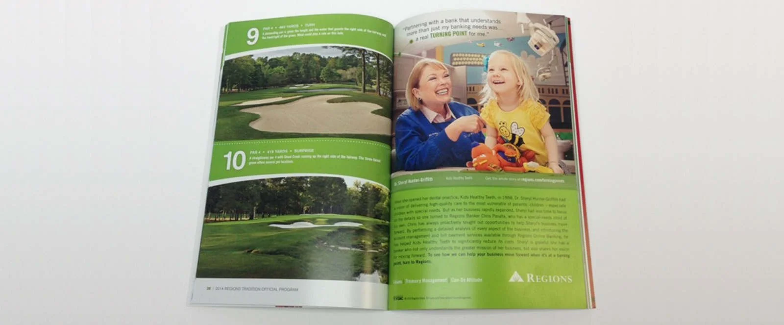
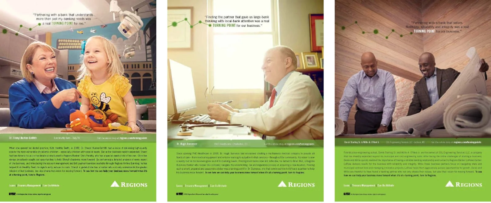
Turning Points Campaign
This campaign took a quieter, more reflective approach to business banking. Rather than selling products, we positioned Regions as the strategic partner business owners turn to during defining moments: expansion, hiring, succession planning, or stepping into new leadership.
The magazine ads featured clean, confident layouts with headline-driven storytelling. Each piece captured a business owner at a crossroads, the visual language suggesting both opportunity and the weight of important decisions. The tone conveyed stability, partnership, and long-term guidance rather than transactional banking.
The call to action directed readers to regions.com/turningpoint, where they could explore business banking tools and advisory resources. These weren't product ads, they were narratives about the moments when smart guidance matters most.
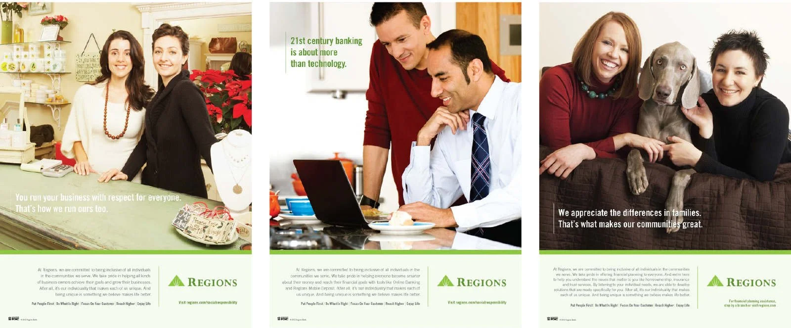
Social Responsibility Campaign
These ads supported Regions' Corporate Social Responsibility initiatives, highlighting the bank's investments in communities, financial inclusion, environmental stewardship, and ethical governance. The message was clear: Regions does more than banking.
The creative challenge was making CSR feel genuine rather than performative. The ads needed to communicate values and community impact while maintaining the professionalism expected from a major financial institution. Visuals and messaging worked together to show Regions as an active participant in building healthier, more equitable communities across their 16-state footprint.
Additional Deliverables:
Web advertising and digital display
Print collateral for direct mail and publications
Outdoor advertising (billboards, transit)
In-branch brand materials and signage
My approach balanced efficiency with thoughtfulness. I internalized Regions' brand standards to the point where adherence became instinctive rather than restrictive, allowing me to focus creative energy on composition, messaging hierarchy, imagery selection, and the subtle choices that differentiate competent work from compelling work.
I developed systems and templates that accelerated production without feeling formulaic, ensuring each piece felt considered even when working at speed. This allowed the agency to meet aggressive timelines while maintaining the quality standards Regions expected.
Results
Successfully produced high volumes of advertising and collateral across web, print, outdoor, and in-branch applications
Maintained strict brand consistency across 16-state market territory
Met aggressive agency timelines while preserving design quality and brand integrity
Supported emotionally resonant campaigns (Turning Points, Social Responsibility) that shifted perception from transactional banking to strategic partnership
Contributed to Regions Bank's ongoing market presence and customer communications across critical business initiatives
Demonstrated reliability as a production designer capable of balancing volume, speed, quality, and strategic messaging
What I Learned
This project taught me the discipline of working within constraints at scale. Brand standards aren't creative prison, they're the foundation that allows large organizations to build trust and recognition. Learning to work fluently within those parameters made me a more strategic designer.
I also learned that speed and quality aren't opposites. With the right systems, internalized knowledge, and focused decision-making, you can produce high volumes of work without compromising standards. The key is eliminating decision fatigue on foundational elements (typography, color, grid) so you can focus creative energy where it matters most (concept, composition, messaging).
The Turning Points campaign specifically taught me that constraint can breed clarity. When you can't rely on flashy visuals or gimmicks, you're forced to focus on what actually matters: the story, the emotional truth, the moment of connection. Sometimes the quietest work is the most powerful.
Working in an agency environment on a major client taught me about collaboration, feedback cycles, and the reality of design as a service business. Not every project is a portfolio centerpiece, and that's okay. Sometimes your job is to be reliable, accurate, and fast while maintaining quality. That's a skill worth developing.
Finally, this experience showed me the value of versatility. Moving fluidly between web, print, outdoor, and environmental design made me a more useful team member and a more well-rounded designer. Understanding how brands translate across channels is essential when working at this scale, and seeing how strategic campaigns like Turning Points and Social Responsibility deployed across touchpoints reinforced that integrated thinking produces stronger work.