Auto Loan Application Redesign
Reducing loan application abandonment by surfacing requirements earlier in the process.
UX Lead | 6 months | Cross‑functional team of 8
Context
Members were abandoning auto loan applications when unexpected requirements appeared mid‑process. The business needed to improve completion rates without compromising fraud prevention or regulatory compliance.
As UX Lead, I redesigned the application to surface all requirements upfront, coordinating Legal, Compliance, Content, and Engineering teams through a 6‑month rebuild.
Problem
Members abandoned when they couldn’t quickly find answers to:
Which loan type fits my needs? (purchase, refinance, lease buyout)
What documents do I need? (insurance, income, trade‑in — often appearing unexpectedly)
How long until approval? (no timeline visibility)
With 67% on mobile, the dense layout and poor hierarchy made these questions hard to answer, leading to drop‑off at critical decision points.
Challenge
I had to balance strict legal requirements with clear guidance across seven stakeholder groups.
CORE TENSION: simplify a regulated process without becoming incomplete or misleading.
Research & Discovery
Analytics review showed members were abandoning the application at key decision points, especially during product selection and information‑gathering steps.
Mobile behavior analysis revealed that 67% of members were on mobile, where dense content and weak hierarchy increased cognitive load.
Cross‑functional reviews with Legal, Compliance, Content, and Product clarified disclosure requirements and where they conflicted with clarity.
Prototype testing validated messaging, layout, and progressive disclosure patterns before development.
Weekly alignment sessions surfaced risks early and ensured shared understanding across seven teams.
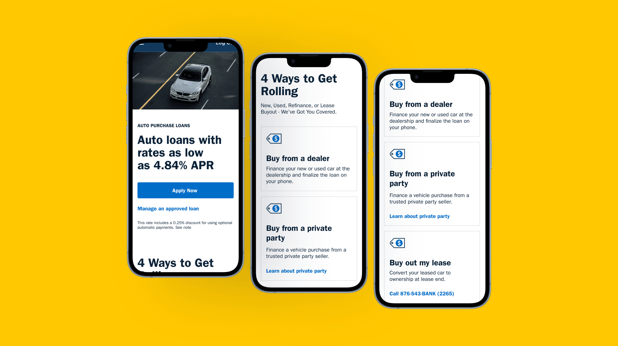
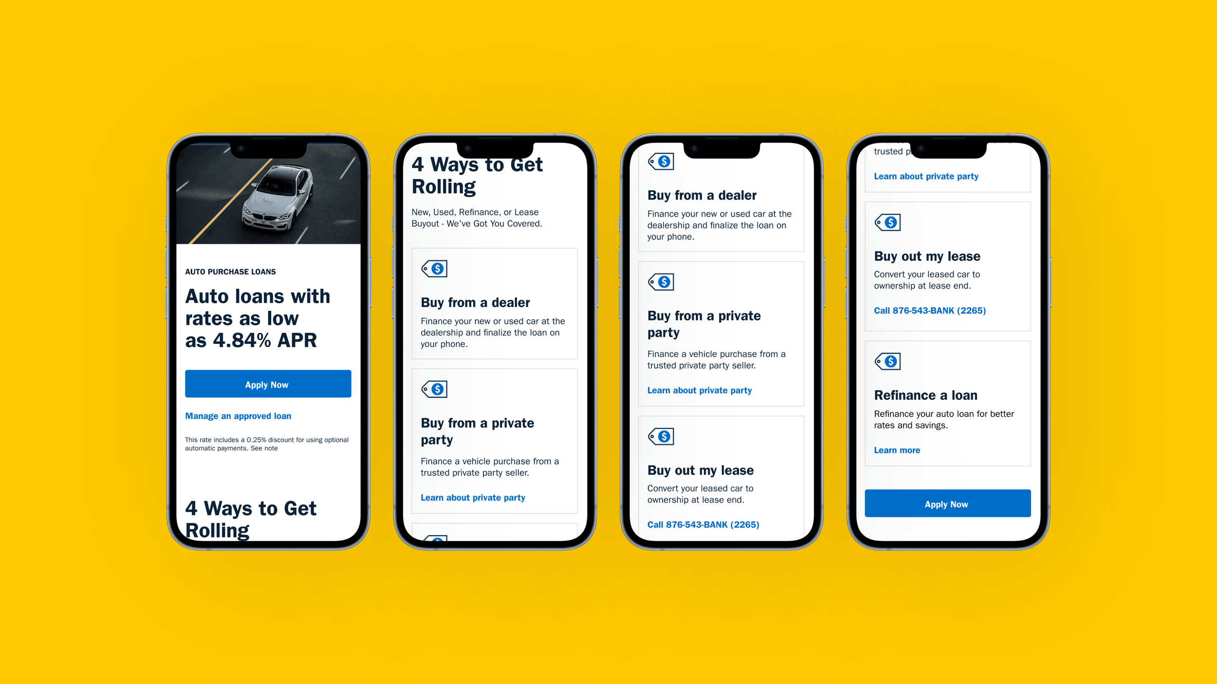
Original design lacked guidance in the member experience.
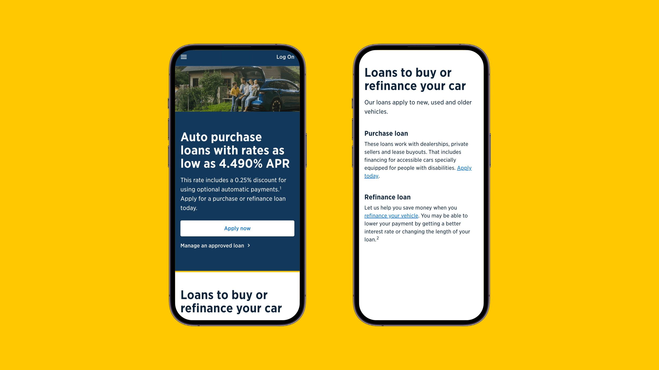
Solution
I established the core principle: surface all requirements upfront through progressive disclosure, preventing users from being surprised mid‑process.
KEY DECISIONS
Loan type comparison tool with eligibility criteria
Upfront checklist of all required documents
Visual timeline showing approval process and current status
Mobile‑first, collapsible layout for 67% mobile traffic
I coordinated weekly with Legal, Compliance, and Product to ensure each iteration met regulatory requirements while maintaining usability.
Redesigned experience with progressive disclosure, clear hierarchy, and mobile-optimized layout.
Results
19% decrease in dropouts at product selection
10% projected lift in new loan applications
Design patterns adopted across three other lending products
Reduced support calls related to application confusion