Sea of Blue
Reducing decision fatigue to drive checking account sign‑ups.
UX Designer | 4 months | Team of 5 (UX Researcher, Product Manager, 2 Developers)
Context
Sea of Blue was BBVA’s annual marketing campaign designed to increase new checking account openings. Although the offer was competitive, the experience didn’t clearly communicate why choosing BBVA was the safer, smarter decision — especially on mobile.
As a result, potential customers compared similar offers across banks and often delayed or abandoned their decision entirely.
Problem
Users encountered multiple checking account offers that looked nearly identical. Instead of feeling confident, they hesitated — driven by uncertainty and fear of choosing incorrectly.
Users needed answers to:
Am I giving up a better offer elsewhere?
Is this $250 reward actually competitive?
If I choose this account, what do I risk losing?
Without clear framing, users perceived risk, not value.
ChallengeS
Decision fatigue was amplified by loss aversion — users focused more on potential losses than gains. When presented with three or more similar options, they became less likely to choose any of them.
I had to:
Reduce visible options to lower cognitive load
Frame the offer to minimize perceived risk and regret
Highlight BBVA’s strengths without overwhelming users

Competitive Analysis of our competitors and what they offer.
Research & Discovery
Competitor analysis across Wells Fargo, Bank of America, and Citi
Evaluation of bonus amounts, fees, minimum deposits, and mobile features
Persona‑driven insights:
Budget‑Focused Beth — fee‑averse, motivated by value
Quick Sign‑Up Sam — wants fast, low‑friction reward
Cautious Saver Chris — prioritizes reassurance and confidence
KEY FINDINGS
Bonuses across banks were similar
($200–$300)Flat visual hierarchy forced mental comparison
Users were more sensitive to potential downsides than upside gains
Users weren’t struggling to understand the offers they were struggling to feel safe choosing one.
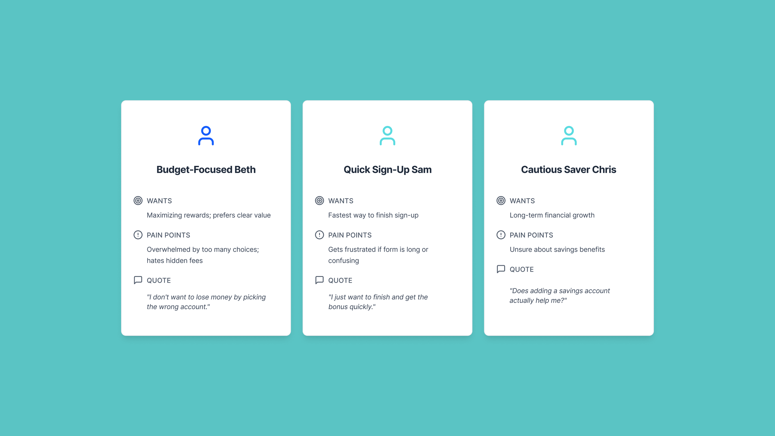
Personas to understand our customers.
Solution
I applied loss aversion principles to reduce perceived risk and increase confidence at the point of decision.
KEY DECISIONS
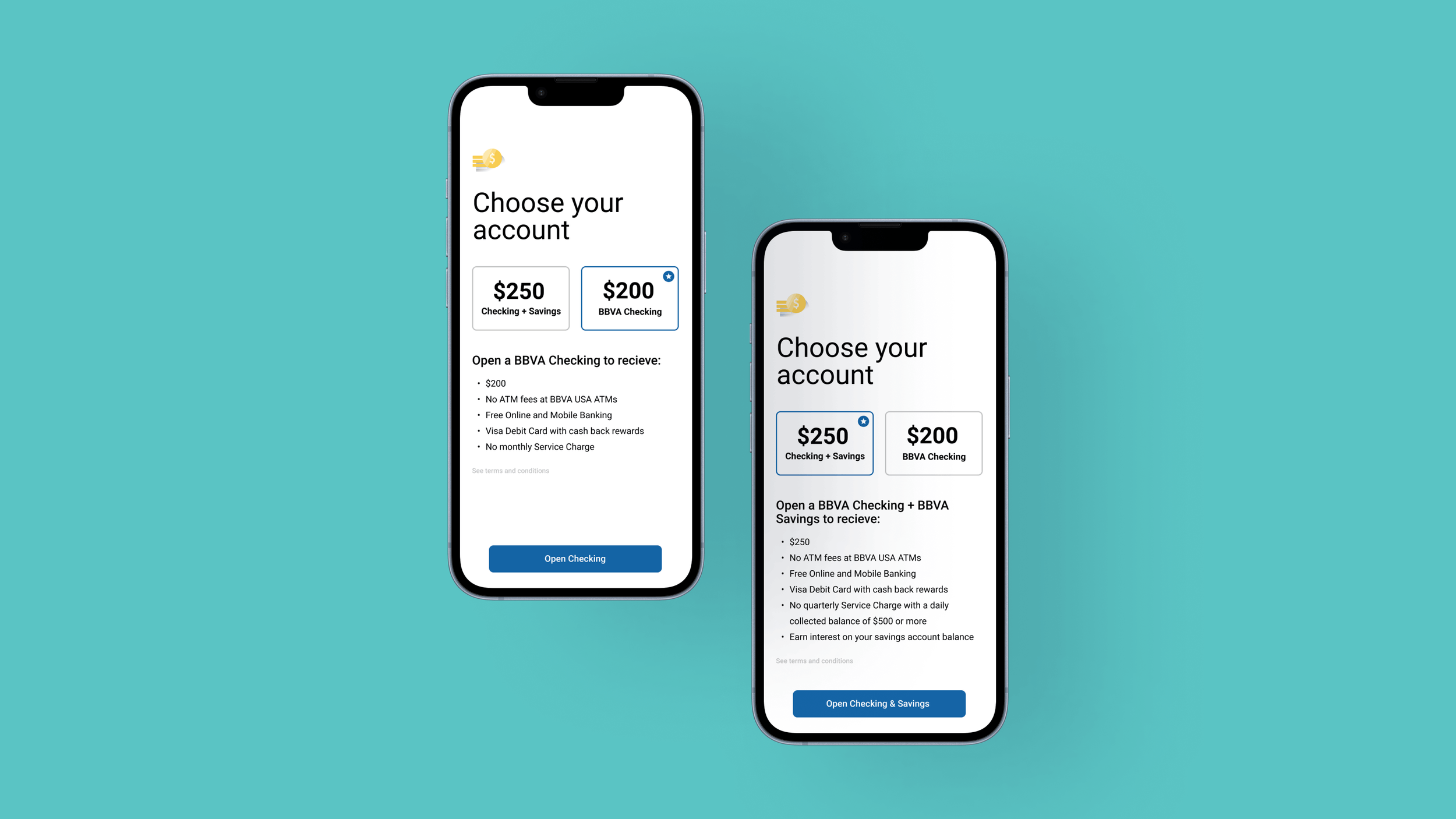
Reduced visible choices to two checking accounts
Framed the $250 bonus as the primary anchor
Used visual hierarchy to signal a “safe” default choice
Surfaced fee and feature information as reassurance
Ensured consistent hierarchy across mobile and desktop
The design helped users feel they would lose more by walking away than by proceeding.
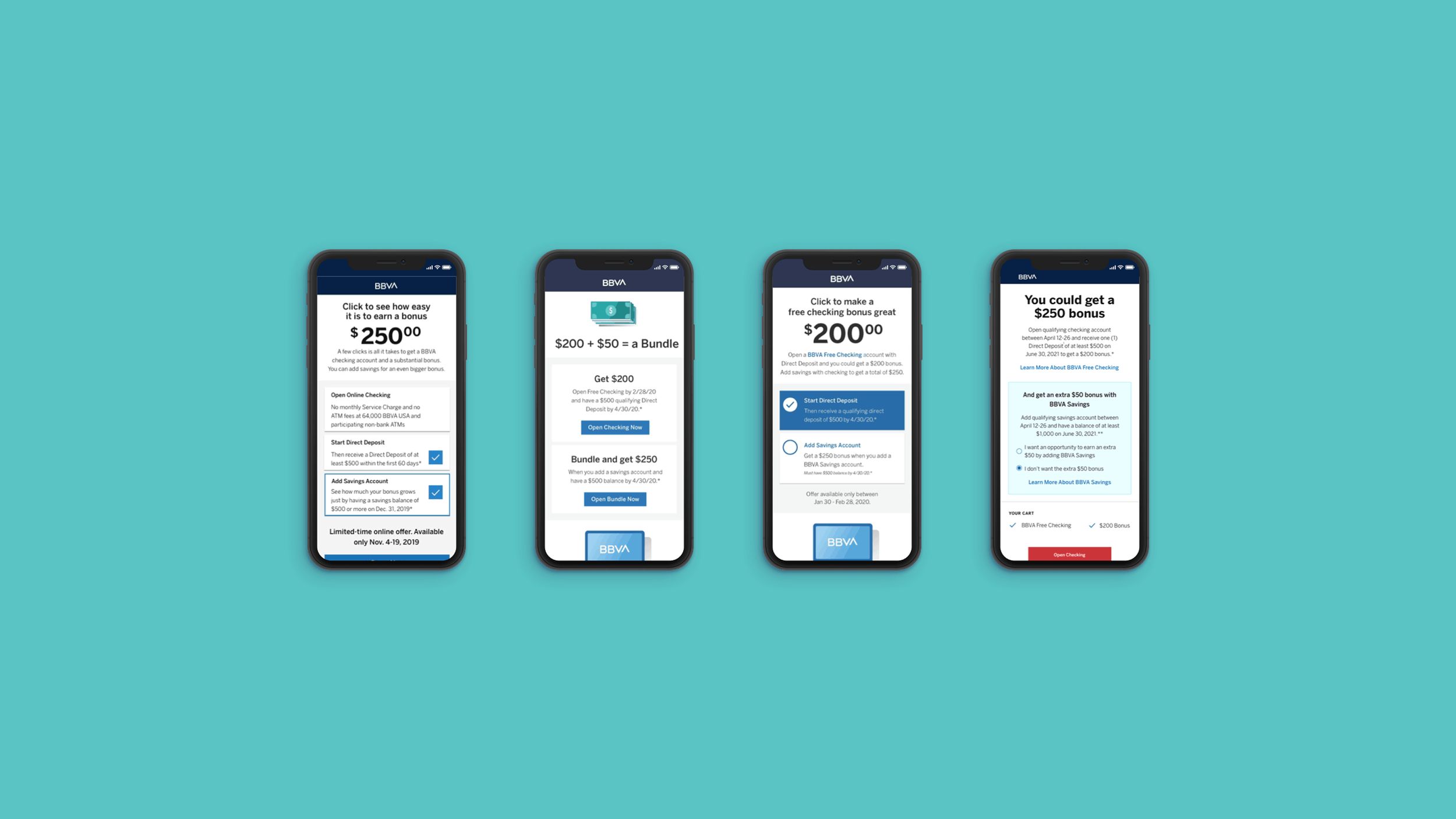
Explored mockups.
Impact
Improved conversion compared to previous campaign designs
Reduced abandonment by lowering perceived risk
Final design approved and launched by BBVA USA in 2019
Stakeholders highlighted clearer value framing and increased user confidence