Help Me Decide
Helping customers make the right choices, helping the business too.
UX Designer | 6 months | Team of 5 (UX Researcher, Product Manager, 2 Developers)
Context
Checking products were difficult for consumers to differentiate. Each option appeared similar, and users lacked confidence in choosing the right one. This uncertainty reduced engagement, increased abandonment, and limited conversion.
The business needed a decision‑support experience that clarified differences, reduced confusion, and increased user confidence.
I delivered more than $2.7 million in annual incremental value for BBVA USA, and the work was recognized by leaders in Behavioral Economics for its application of choice architecture.
Original design: Cognitive overload lead to customers choosing the free checking account.
Problem
Users struggled with three core issues:
Very similar products — checking options looked nearly identical to non‑experts.
Tyranny of choice — multiple similar options created hesitation and decision paralysis.
Low confidence — users wanted help choosing, clear explanations, and reassurance that the product fit their goals.
Without guidance, they defaulted to inaction.
Challenge
The experience had to reduce cognitive load in a high‑stakes decision, work within existing technical constraints, and support business goals without overwhelming users.
CORE TENSION: guide users through a complex decision without oversimplifying or overloading them.
research & discovery
Competitive analysis showed that many financial comparison tools offered multiple calculators but lacked clear organization or guidance.
User research insights revealed that customers were unsure which calculator to use, often bounced between tools, and valued clarity over feature depth.
Behavioral economics foundations informed how to reduce choice overload, clarify tradeoffs, and build trust in recommendations.
Technical constraints review confirmed that each calculator had to remain a standalone tool on separate subdomains.
Business alignment clarified that success required improving both customer decision‑making and overall conversion.
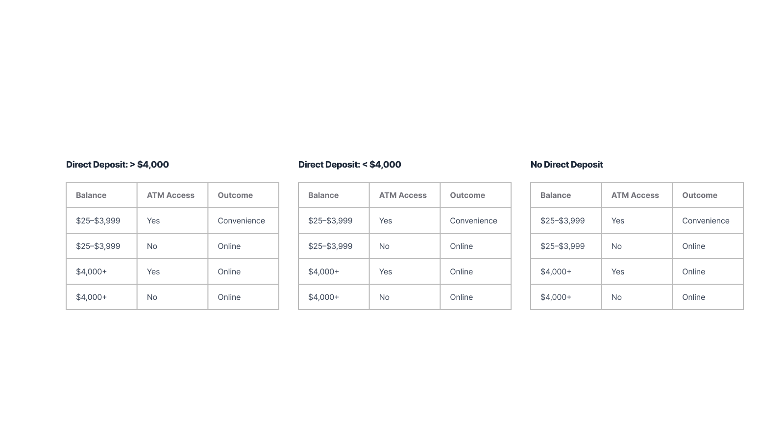
Decision Matrix: 3 accounts 6 different paths.
Solution
I designed a guided decision experience that helped users understand differences and choose confidently.
DESIGN APPROACH
Grounded in behavioral economics:
Choice architecture to reduce cognitive load
Progressive disclosure to reveal detail only when needed
Heuristics and biases to frame options effectively
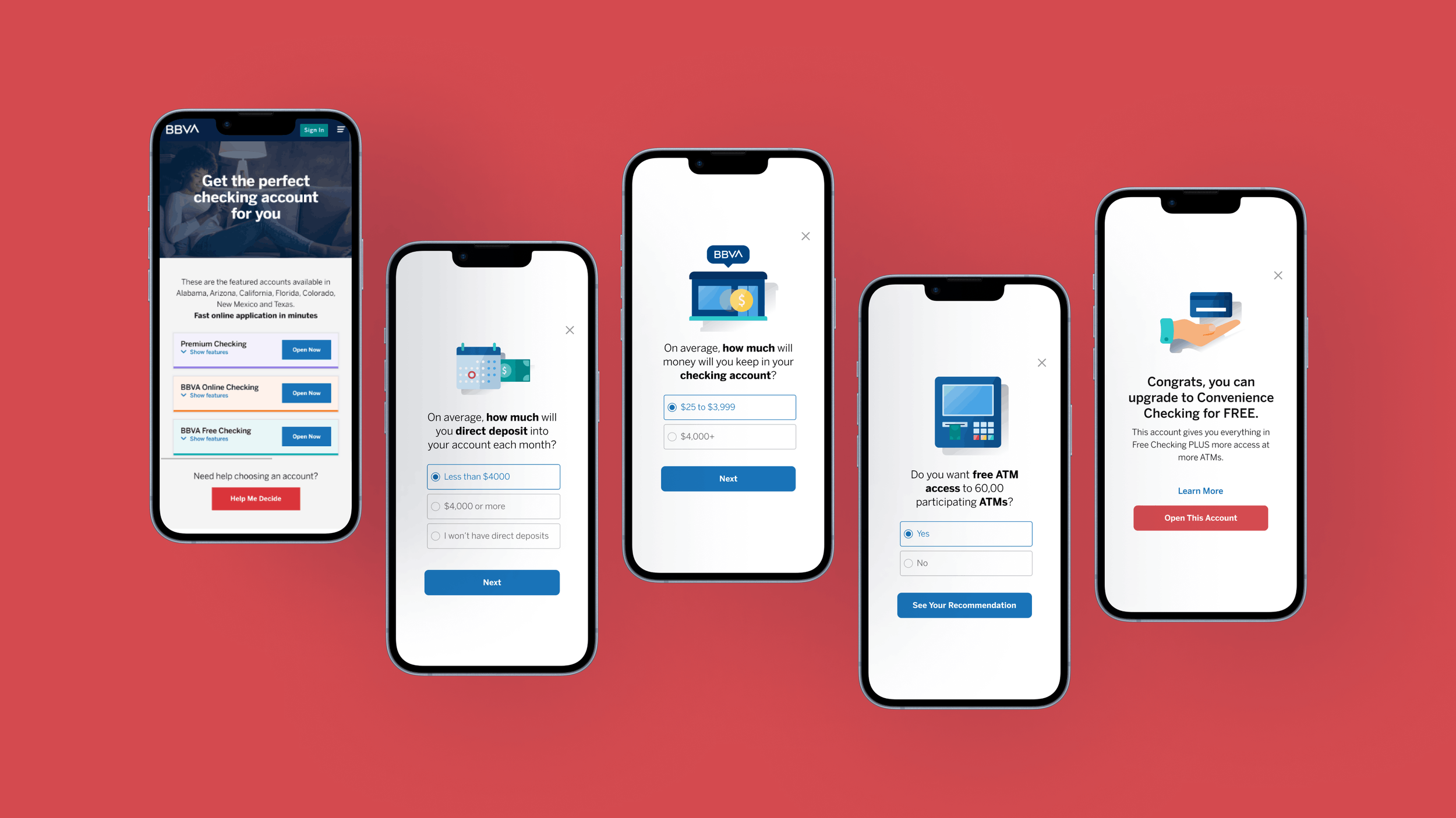
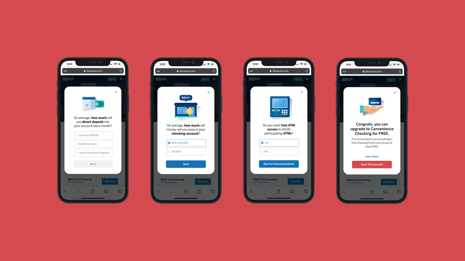
The experience guided users through questions about financial goals, risk tolerance, product features, and suitability.
KEY DECISIONS
Created a decision matrix to structure product comparisons consistently
Applied progressive disclosure to avoid overwhelming users
Designed consistent visual hierarchy across key screens
Built mobile‑friendly layouts for real‑world usage
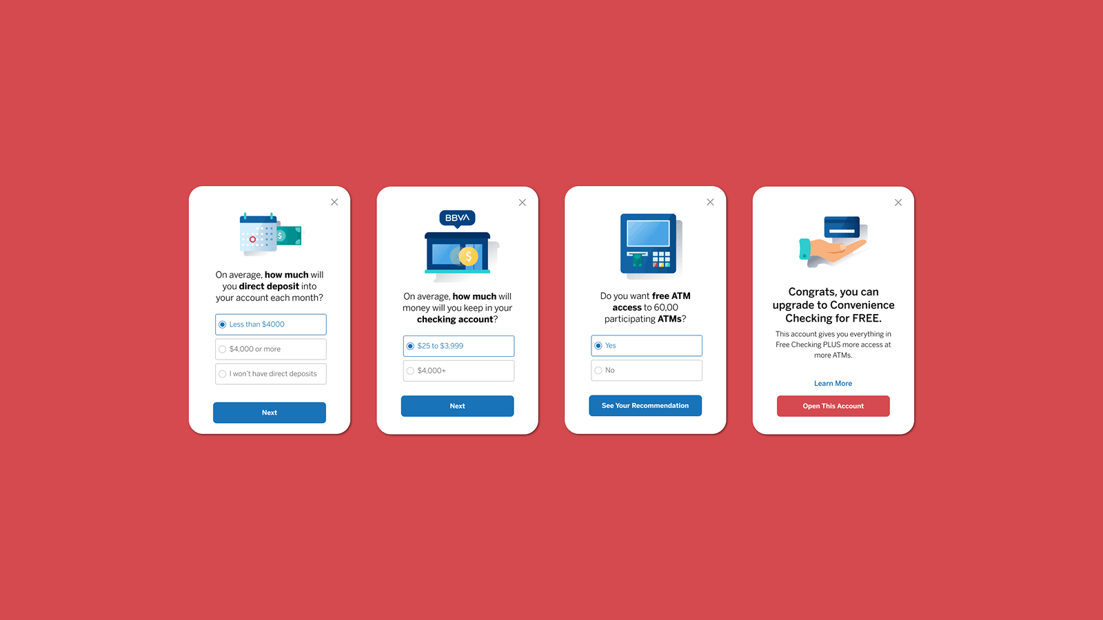
Help me Decide modals
impact
Contributed to $2.7M+ in annual incremental value
Recognized by leaders in Behavioral Economics
Improved product differentiation and user understanding
Increased engagement and conversion
Reduced confusion and decision paralysis
Adopted as a model for other product experiences
Help me Decide screens