Mortgage Calculator Design System
Transforming generic third‑party tools into brand‑aligned, trustworthy member experiences.
UX Lead | 2 months | Cross‑functional team of 8
Context
Our mortgage pages relied on third‑party calculators with minimal customization. They didn’t support key mortgage scenarios, didn’t reflect our brand, and created friction for members trying to estimate payments or compare options.
The business needed a consistent, trustworthy calculator experience aligned with brand standards and scalable across multiple tools.
Problem
Functional Gap
No working calculators — members couldn’t estimate payments or compare options.
Brand Inconsistency
LeadFusion’s default calculators didn’t match our typography, colors, spacing, or interaction patterns.
Technical Constraints
I needed to update 16 calculators within a platform that allowed only limited customization.
Priority & Scope
The mortgage calculator was the first focus, establishing a pattern for the remaining 15.
Challenges
I had to deliver a branded, trustworthy experience within severe technical constraints.
CORE TENSION: make it feel native while working inside a rigid vendor framework.
Research & discovery
Stakeholder interviews with Legal, Compliance, Product, and Engineering clarified privacy risks, iframe limitations, and scope boundaries.
Competitive analysis of banks and fintechs revealed gaps in clarity, responsiveness, and trust‑building features.
Brand standards audit surfaced inconsistencies in typography, spacing, and accessibility across the existing calculator.
User needs validation through a mortgage calculator survey identified key expectations: payment estimation, comparison, mobile responsiveness, and trustworthy presentation.
Constraint mapping defined where the third‑party tool could be adapted versus where supporting UI was required.
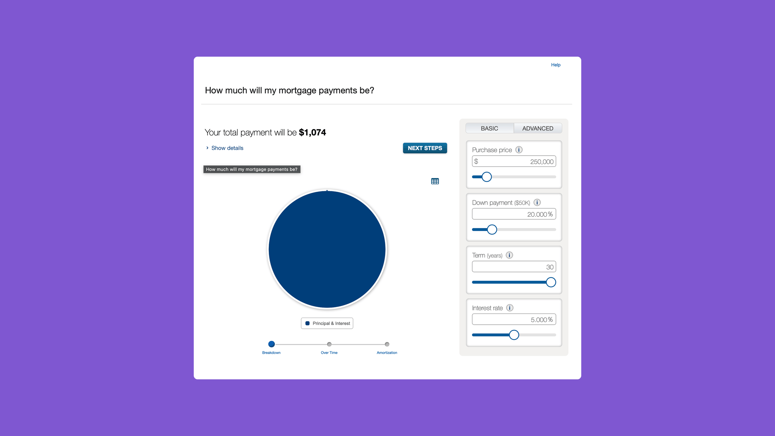
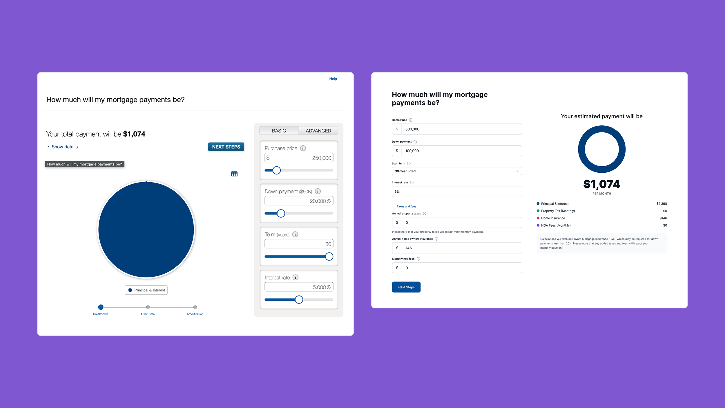
Before: Generic LeadFusion Calculator
Solution
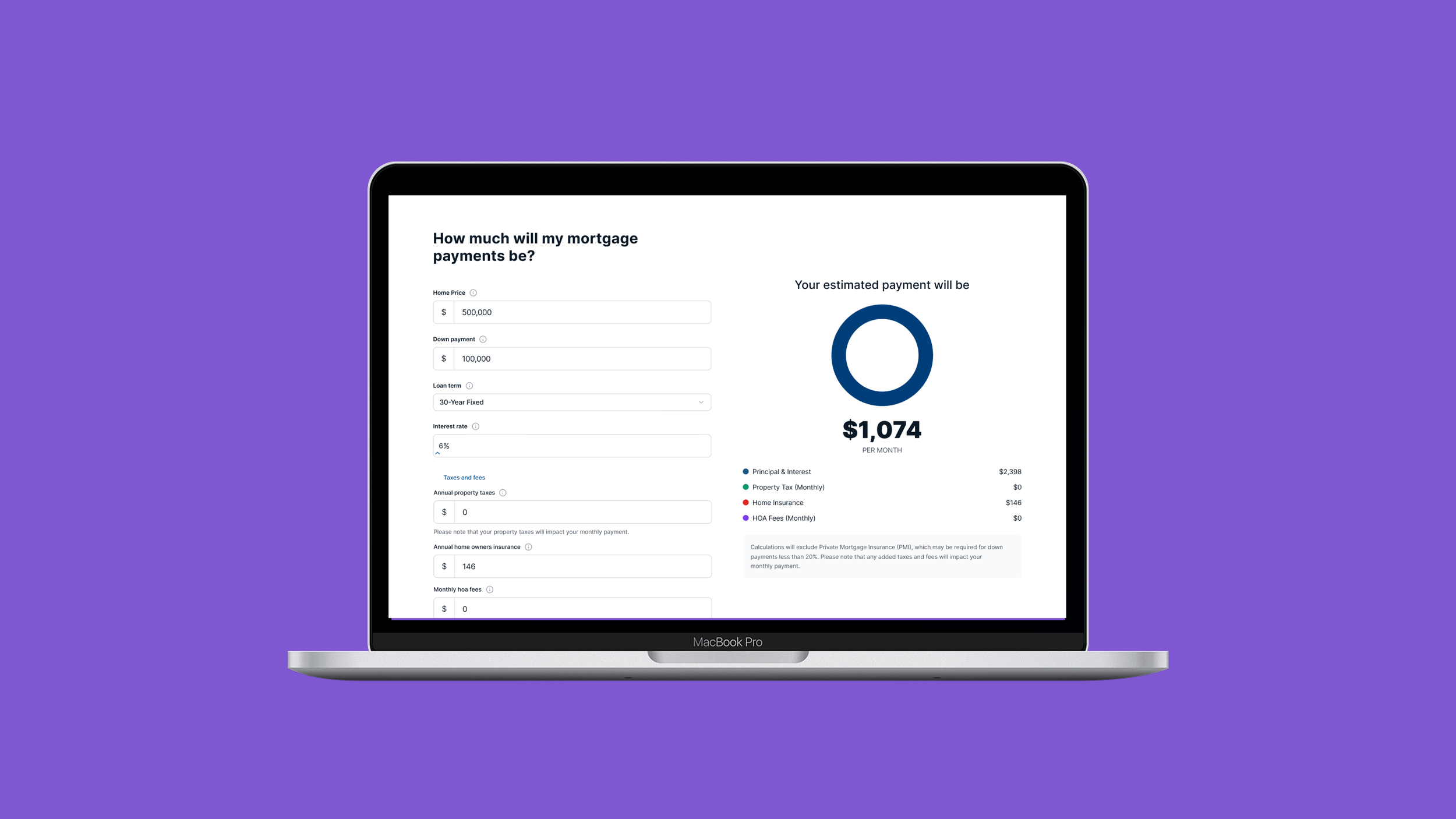
I defined and delivered a brand‑aligned calculator system that improved trust, consistency, and usability.
KEY DECISIONS
Created a consistent, branded layout within component limitations
Improved clarity of inputs and results
Aligned visuals and interactions with our design system
Built a scalable pattern library for 15 additional calculators
Ensured cohesive behavior across desktop and mobile
I collaborated with brand, content, legal, and accessibility teams to ensure alignment across the digital ecosystem.

AFTER: Bank Branded Experience
Results
Delivered a consistent, brand‑aligned experience across 16 calculators
Improved clarity and trust for members evaluating mortgage options
Accelerated updates through reusable patterns
Established a scalable foundation for future enhancements
Original design lacked guidance in the member experience.